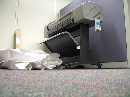
In a world with printable media at your beck and call, it makes sense that at some point, you might consider the idea that someone wants to see your work in a more permanent way. Whether it is an important tips list for a topic, or a list of instructions that is going to be more accessible away from the computer, you are going to want to give your readers a way of putting your webpage to paper in the most convenient way possible.

Image Source: juhansonin
The following are a list of tips that you can use when you are trying to move your content from the virtual world of the monitor into the physical one of actual paper.
1. Using CSS!
If you know your way around CSS, then it shouldn’t be very hard to create a stylesheet that is specifically made for printing. The standard that people tend to use is print.css, and it includes none of the bells and whistles that your webpage normally has. Remove the header, the footer, any advertising, and make the font nice and large so it is easily read by anybody who is going to want to print your content. This concept alone will make it tons easier, and your clients will thank you for it.
2. Link To A New Page!
Place a link at the bottom of each blog article, so that your users know what to click. Something as simple as an icon of a printer is going to go a long way in making your work easier to move around. A lot of the popular blogging softwares already have this as an option, and if they don’t, then somebody has probably created a plug-in that will do the very same thing.
3. Simple Is Better
Remember that you may like to use that special font for your posts, but it might make it harder to read on the written page. Strip away all of the color and strange fonts, and keep it with a straight and easy to read serif font. Also, take note of any of the graphics you have on the page. Ask yourself if they are necessary, and get rid of any piece of pretty fluff that paints your website properly, but is going to look bad on the printed page.
4. Brand Yourself
Just because you want to keep it simple, doesn’t mean that you shouldn’t be recognized for your work. Make sure to keep your byline at the very least, but don’t hesitate in keeping a logo graphic or watermark of some sort to make sure people know where your piece came from. Sometimes items like this get passed around an office or friends, so it is good to make sure they are exposed to the source of the information as well as the blog post itself.
5. The Way Back
Assuming your user is going to want to hit the BACK button every time they go and print something is assuming a lot. The key to good web design is making everything simple for them. This includes being able to leave the printed page and get back to your fully functional site. Make the button an obvious left facing arrow, or a simple button that says ‘BACK’ on it to guarantee that they continue perusing the information you have put together for them.
From the computer screen to the printed page and back again, you have created something that resonates with your readers, and they want to love it forever. Now is the time to get back and write some more, so you can hold onto them for even longer.
Employed by a leading printer cartridge shop in the UK, James is currently occupied with a number of writing and reviewing tasks that involve HP printer cartridges.

Number 3 is a must. Making the page use as little ink as possible will encourage more people to print it out. Same thing for making the printed part small, especially for a coupon.